Nothing Gallery App Concept Reveals Some Interesting Features
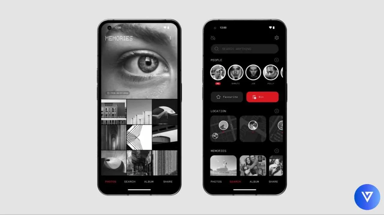
A few days back Carl Pei, CEO of Nothing asked users on X (formerly Twitter) regarding the development of the Nothing Gallery app for Nothing devices. Today, a guy called Aman has shared a new Nothing Gallery App concept which follows the Nothing design language and has some very interesting features.
Nothing devices have stock applications such as Nothing Launcher, widgets, weather, etc. but they lack when it comes the stock gallery app and Nothing is already planning to develop a separate Nothing Gallery app for Nothing devices which may be introduced in the Nothing OS 2.5 or Nothing OS 3.0 version but it’s not confirmed yet.
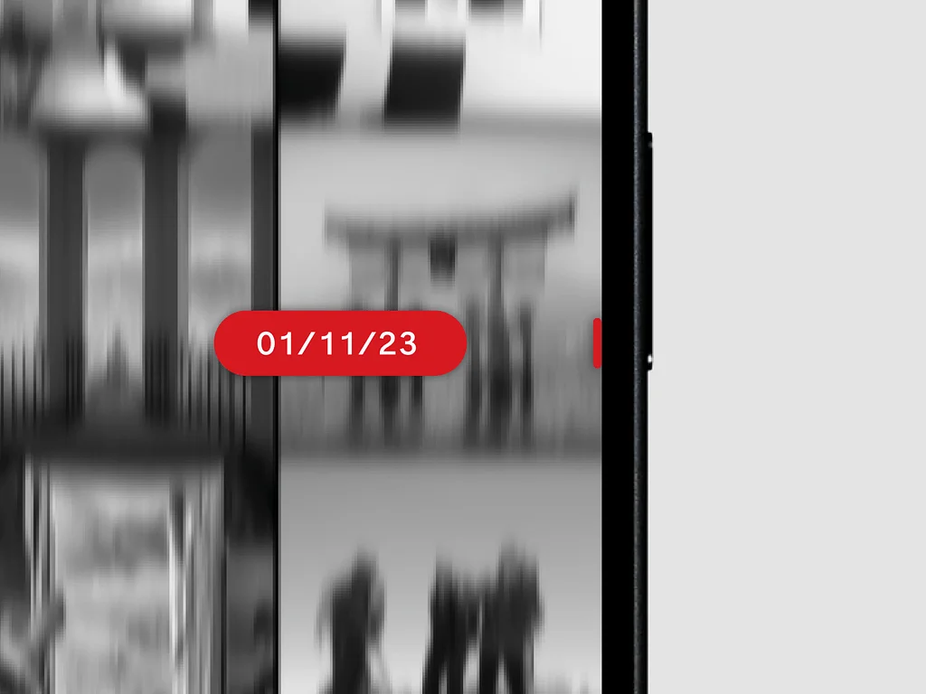
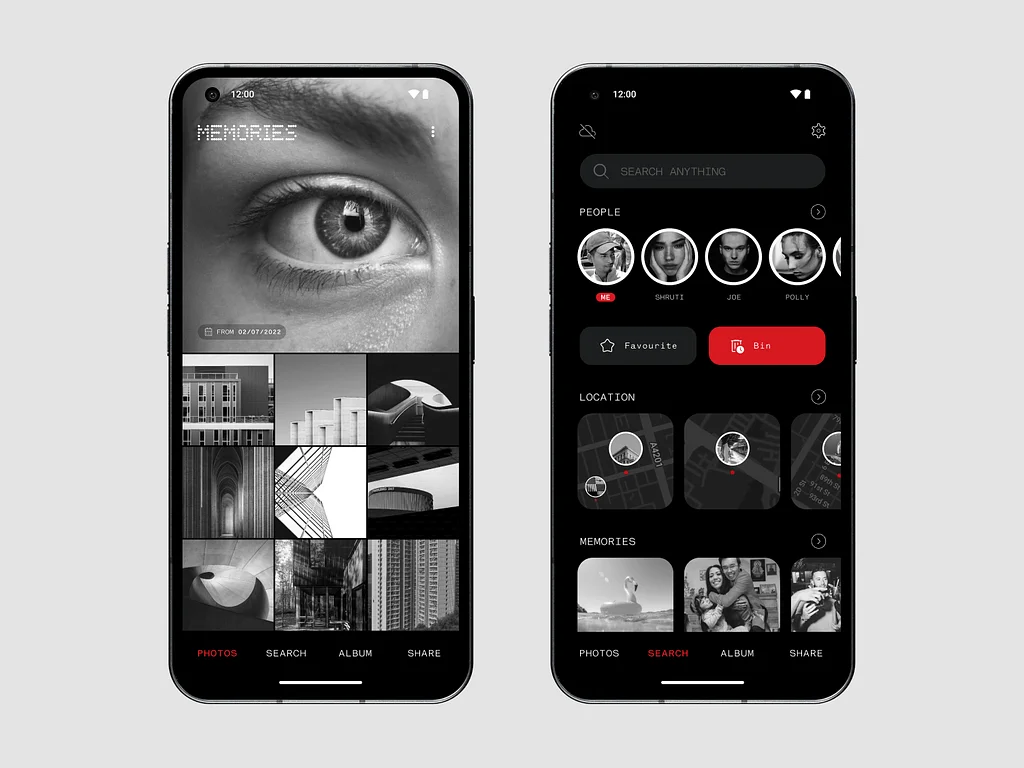
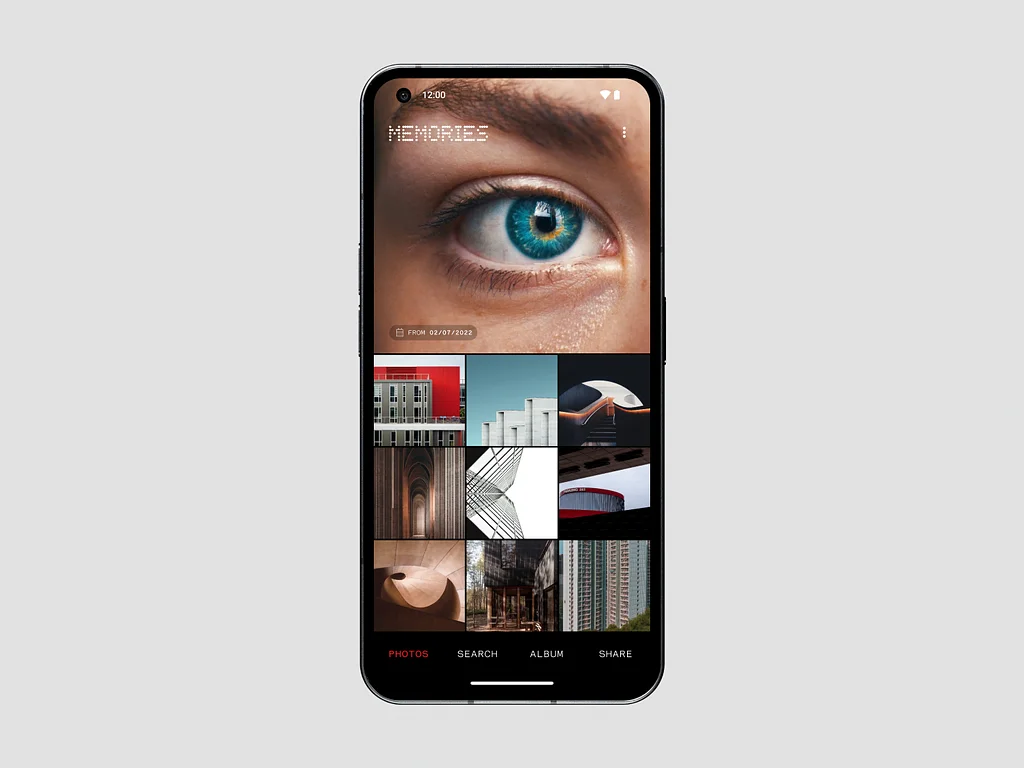
Aman has shared a new concept for the Nothing Gallery app which looks stunning because of Nothing’s design language. Firstly, it has Nothing’s dotted font for the highlights on the top. Additionally, the color combination of red & black looks pleasing to the eyes. Moreover, there are separate tabs at the bottom of the app.
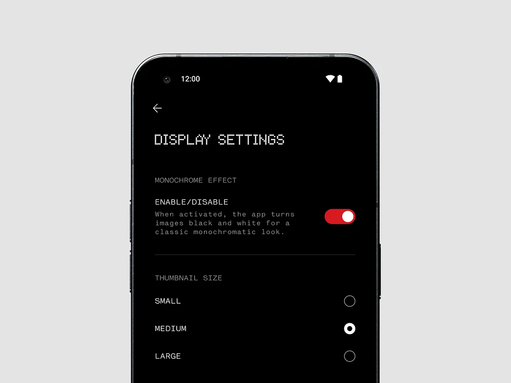
Apart from this, there is a toggle from which you can actually enable/disable the monochrome effect and thumbnail size. Also, the slider follows Nothing’s design language. Overall the new concept is looking gorgeous. What do you think about it? Let us know in the comments below.
![Nothing Rolls Out Nothing OS 2.5.1 Closed Beta based on Android 14 for Phone (1) [Download] 8 Nothing Rolls Out Nothing OS 2.5.1 Closed Beta based on Android 14 for Phone (1) [Download]](https://techroma.in/wp-content/uploads/2023/11/Nothing-Phone-2a-is-in-making-Here-are-the-expected-specifications-768x425.jpg.webp)
![Download Nothing OS 2.5 Launcher, Weather, Recorder, Screenshot & Wallpapers Apps Update 11 Nothing Launcher 2.2 is now available for Nothing users [Download]](https://techroma.in/wp-content/uploads/2023/08/nothing-launcher-2.1.4-update-download-768x425.jpg.webp)
Plz nothing phone 2 update
nothing phone 2 is already running on latest Nothing OS 2.5 version based on Android 14
Didn’t coming to the update my phone
Why does the nothing os 2.5 is not available in Nothing phone 1?
it’s available for 20 selected users who are currently testing internal beta of Nothing OS 2.5 update on the Phone (1)